
Restaurant Branding · Sousse, Tunisia
MINATO — The Harbor of Premium Sushi
Complete brand identity for MINATO (港) — authentic Japanese for "harbor" — a premium sushi restaurant at Port El Kantaoui. Logo system, packaging, social media design and a website in the making: a bridge between Japanese tradition and the coastal charm of Sousse.
CLIENT
MINATO Premium Sushi
SERVICES
Identity • Packaging • Social
DURATION
2025 — Ongoing
INDUSTRY
Food & Hospitality
"From the Ocean's Heart to Your Plate."
MINATO PREMIUM SUSHI — ローリング・ノリ — MADE IN SOUSSE
The story
Why "Minato"?
Minato (港) is the authentic Japanese word for harbor — a sanctuary where journeys begin, cultures converge, and the freshest seafood arrives from the ocean. For a premium sushi restaurant sitting right on the water at Port El Kantaoui, the name isn't decoration. It's geography.
The name had to pass a hard test before it earned the sign above the door: authentic in its use of genuine Japanese language and Kanji, short enough to pronounce for locals and tourists alike, sophisticated enough to carry a premium feel — and visually strong enough that a single Kanji character could anchor the signage.
It creates a perfect bridge: Japanese tradition on one side, the maritime charm of Sousse on the other. That bridge became the entire identity — every color, every pattern, every package flows from it.
Naming
What the name carries
Five tests, passed before the first sketch.
Genuine Japanese language and Kanji signal respect for the cuisine's roots.
Short, elegant, and phonetically easy for both locals and tourists to pronounce.
Directly evokes freshness, the sea, and safe arrival — exactly what a harbor promises.
Carries a premium feel that appeals to a diverse clientele.
The Kanji 港 provides a unique, striking element for signage and branding.
If the name doesn't taste of the sea, it doesn't go above the door.
Brand guidelines
The identity system, up close
No PDFs, no downloads — the whole system lives right here on the page: the mark and its meaning, the palette, the type, and the wave pattern that ties it together.

One letter, three stories
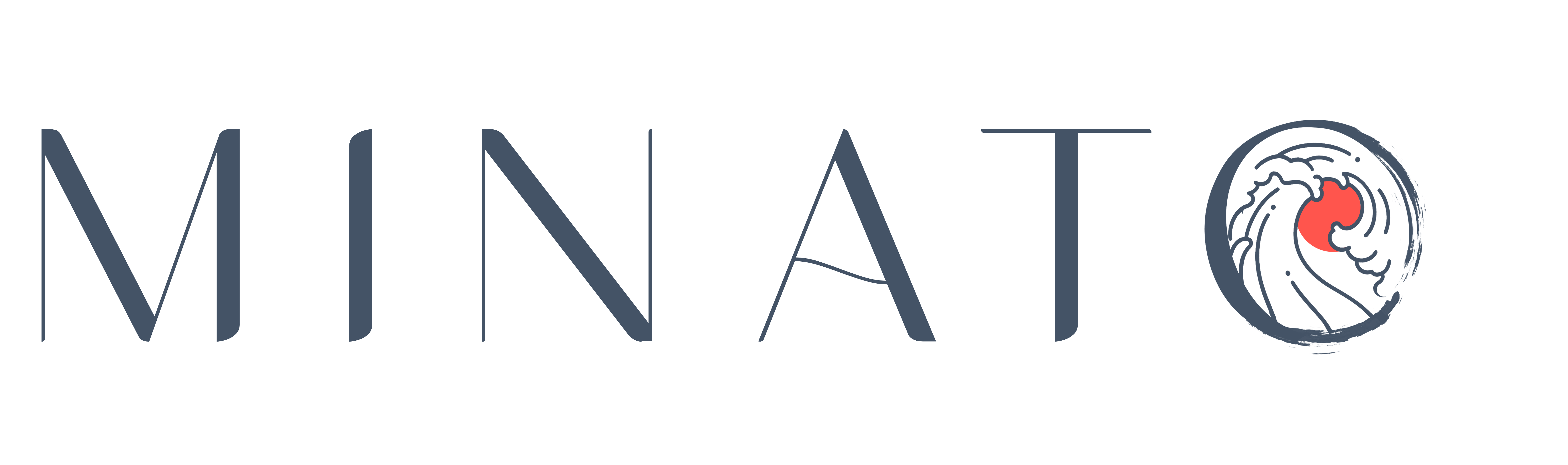
The logo is formed from the letter "O" of MINATO — fused with a sea wave and the round silhouette of rolling sushi. Look again: it's the harbor, the ocean, and the craft, drawn as a single circle.
It holds at 32 pixels on an app icon and at three meters on a storefront — the same wave, the same roundness, the same story.
Type — clarity first
A clean sans-serif face, chosen because it works best when clarity is required — menus, tables, numbers and small body text. Kanji set in a serif voice for the moments that deserve ceremony.
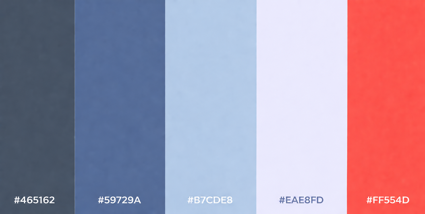
Five colors, straight from the ocean. Click any chip to copy its hex.
Packaging
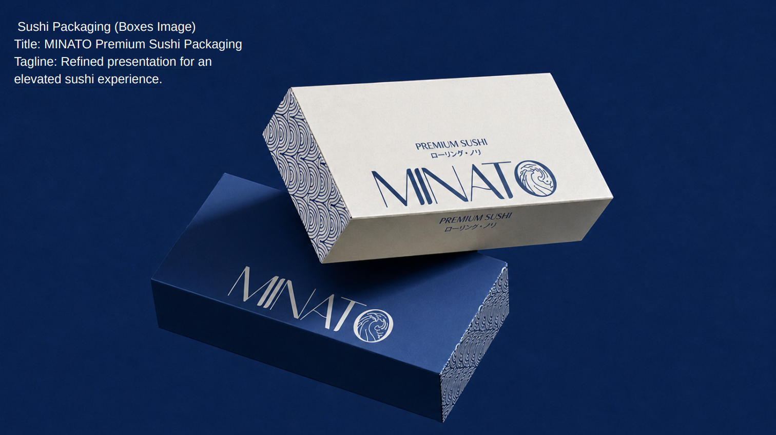
Refined presentation
Packaging is the first bite — before the chopsticks ever land. The system carries the wave pattern, the slate depth and one coral accent across every box that leaves the harbor.
The promise
Three pillars, spoken in two languages
3
PILLARS OF THE BRAND
Fresh Ingredients
新鮮な食材
Fresh ingredients, refined recipes, and a passion for authentic Japanese flavors.
32
PX — SMALLEST LOGO SIZE
Expert Preparation
職人の技
Craftsmanship in every cut — the mark holds from an app icon to a storefront.
5
COLORS, ZERO NOISE
Authentic Experience
本格的な体験
Every bite is a journey — and every touchpoint speaks the same visual language.
On the feed
Social media designs
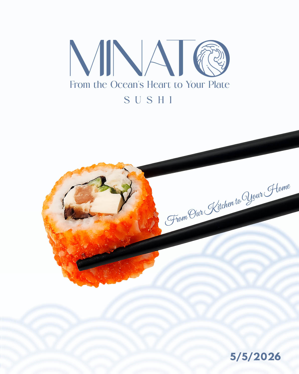
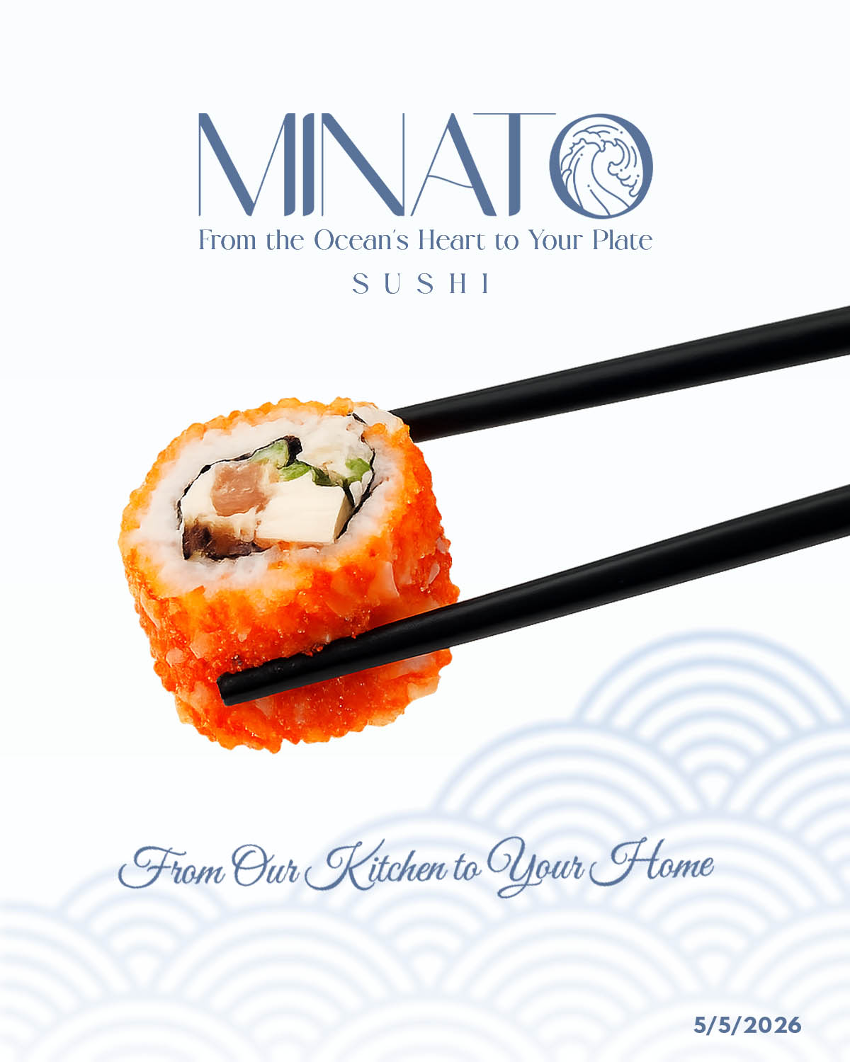
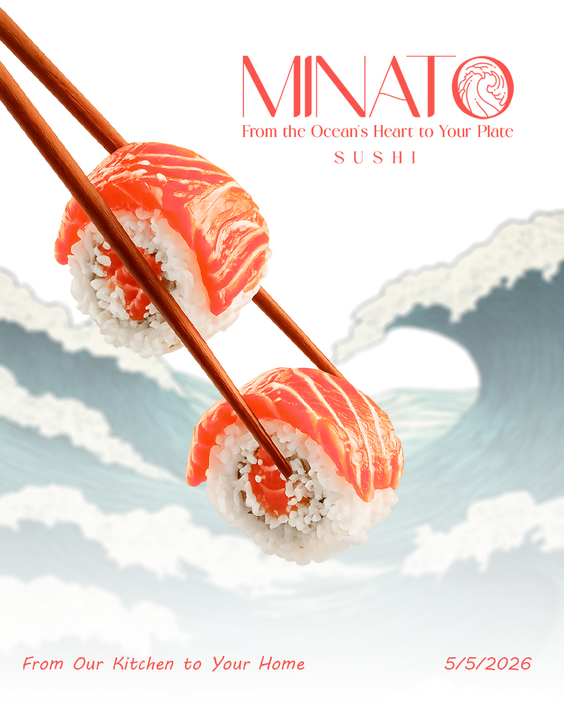
Launch content built on the pattern and the palette — product drops, the dining essentials and delivery announcements, all unmistakably MINATO. Follow the harbor on Instagram.
@minato.sushii on Instagram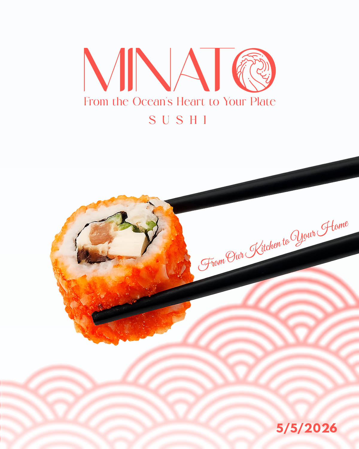
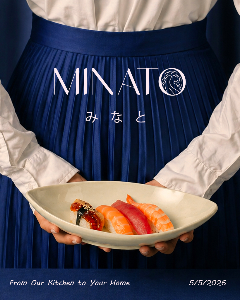
WEBSITE IN BUILD
The harbor is getting its own dock online.
The full MINATO website — menu, online ordering and delivery for Sousse — is under construction by WYRM. Until it launches, the harbor is open on Instagram: fresh drops, the dining essentials, and delivery in Sousse.
The Challenge
Premium sushi on the Tunisian coast competes in a market full of generic takeaway branding. MINATO needed an identity sophisticated enough for a fine-dining menu, warm enough for a tourist promenade, and authentic enough to honor Japanese tradition — all while staying unmistakably local to Port El Kantaoui.
The Solution
A harbor, told visually: a name with real meaning (港 — port), a mark fusing the "O", the wave and the maki, a disciplined five-color palette ruled by slate depth and one coral accent, packaging with the wave pattern at 40% opacity, and a bilingual voice — Japanese soul, Sousse address. The website is the next dock under construction.
OUTCOME
A harbor, branded — and still expanding.
A complete identity system running across the storefront, the packaging, the dining essentials and a live social feed — with the website as the next touchpoint in production. One wave, consistently applied.
Your brand next
Craving a brand people can taste?
Whether you're a restaurant, a label or a creator — we build identities that carry the whole story, from concept to final code.
Next Case Study