Beverage Branding · Full Stack
WDRINK — Energy You Can See
A vibrant energy drink brand built from zero — full visual identity, a mascot you can't ignore, Red Cherry can packaging, and motion design with one message: RUN AS FAST AS YOU CAN.
CLIENT
WDRINK Energy
SERVICES
Identity • Mascot • Motion • Web
DURATION
2025 — 2026
INDUSTRY
Beverage / FMCG
"RUN AS FAST AS YOU CAN."
WDRINK — ENERGIZE • FOCUS • CREATE
The story
Standing out from the crowd
The energy drink shelf is a wall of noise — every can screaming at the same frequency. WDRINK came to us with a simple ambition: don't just join the shouting, be the one can people reach for because it looks alive.
So we built a brand that moves. Bold, playful typography that never sits still. An electric blue palette charged with one cherry-red accent. And a mascot nobody else on the shelf has: a fun, animated blue can with a face — the brand itself, turned into a character.
From strategy to the can in your hand to the frames of the motion campaign, everything speaks one language: energy you can see.
Brand guidelines
The identity system, up close
No PDFs, no downloads — the whole system lives right here on the page: the logo on both grounds, the electric palette, and the asset board.
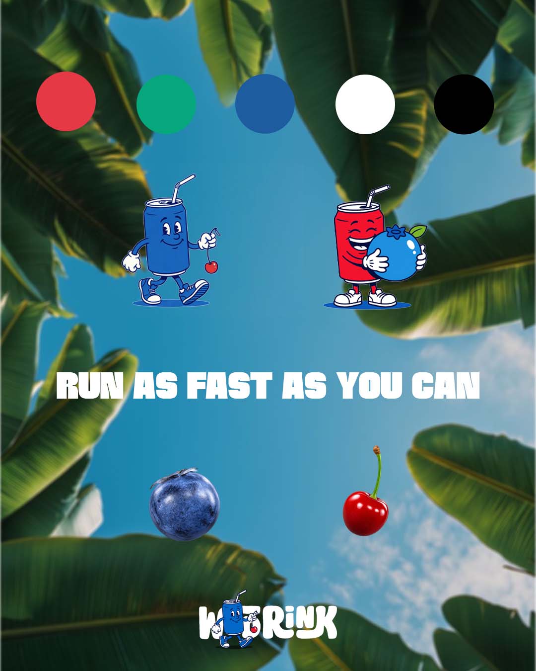
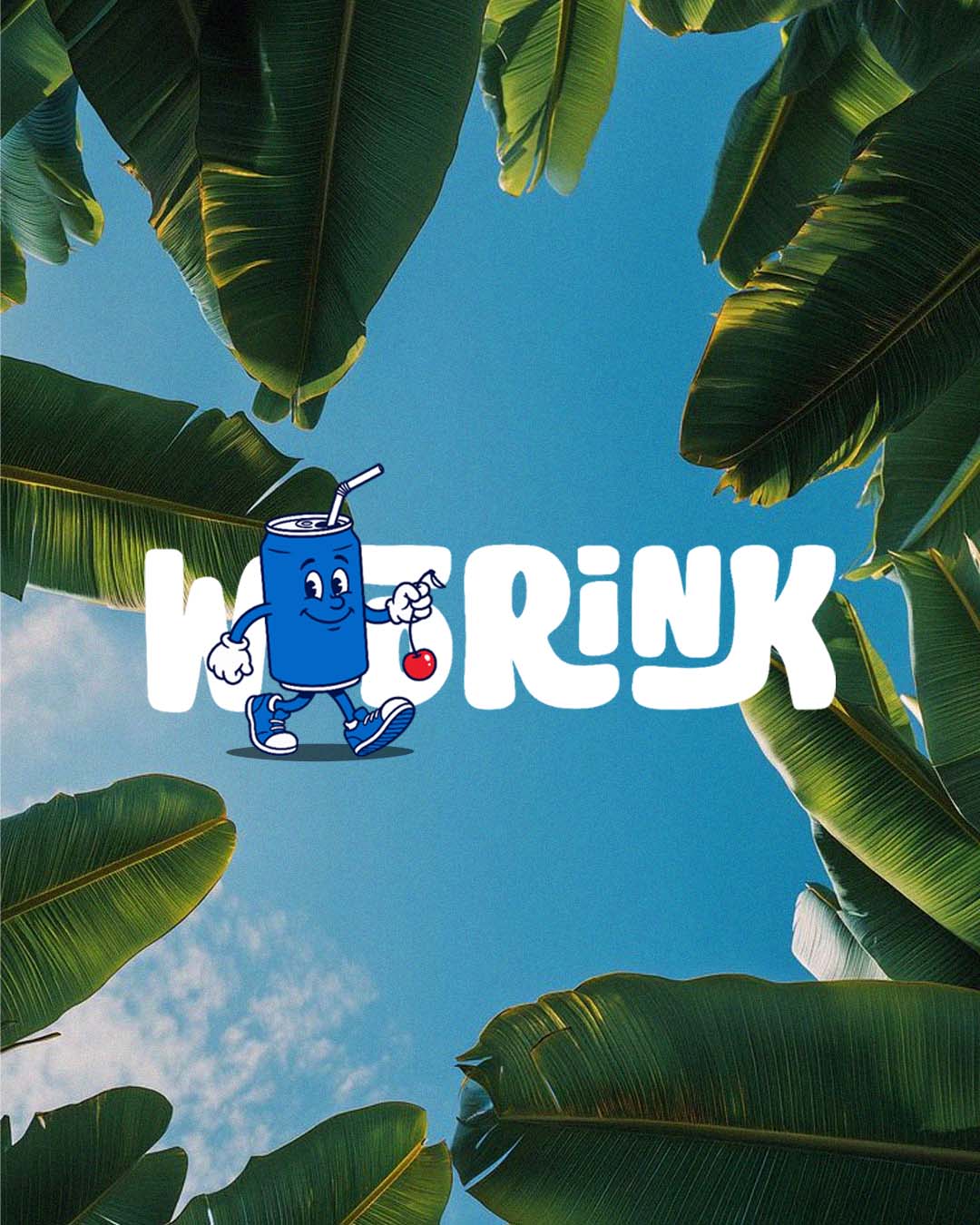
Electric blues, one cherry spark. Click any chip to copy its hex.
Packaging
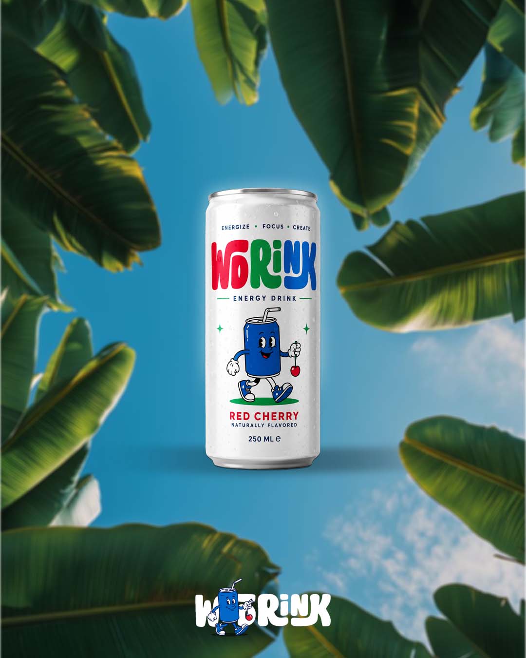
Red Cherry — 250 ML of loud
Eye-catching can design for the Red Cherry flavor, carrying the brand's three-word promise — Energize, Focus, Create — and a mascot that makes the shelf look asleep next to it.
.jpg)
.jpg)
Motion design
Run as fast as you can
Dynamic video content that captures the brand's high-energy spirit — the mascot in motion, the palette at full charge, and one command repeated until you move.
The full WDRINK motion design video — watch the mascot earn its keep. Watch on YouTube ↗
WEBSITE — LIVE
The brand, running on the web.
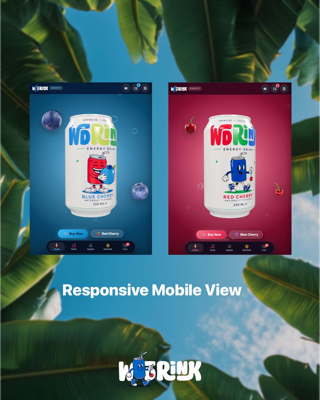
We designed and built WDRINK's website too — the identity carried from the can to the screen, responsive from a 4K monitor down to the phone in your other hand.
Visit the WDRINK website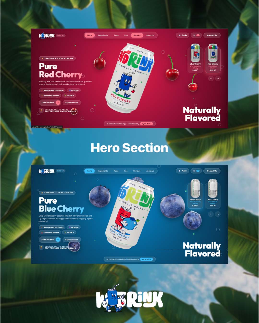
The Challenge
A new energy drink entering a shelf ruled by global giants — where every competitor owns loud colors, extreme sports and typography that yells. WDRINK needed to be impossible to ignore without looking like anyone else, and needed a brand world flexible enough to stretch from a 250 ML can to a full website.
The Solution
A complete identity with personality at its core: bold playful typography, an electric blue system charged with cherry red, a custom animated can mascot, packaging built around Energize • Focus • Create, a motion campaign under one command — RUN AS FAST AS YOU CAN — and a live website carrying it all to the screen.
Deliverables
Brand Identity
- —Complete visual system
- —Bold, playful typography
- —Energetic color palette
- —Logo system, light & dark
Mascot & Packaging
- —Custom blue-can mascot
- —Red Cherry 250 ML can design
- —Energize • Focus • Create messaging
- —Shelf-ready product renders
Motion & Web
- —"RUN AS FAST AS YOU CAN" film
- —Dynamic social content
- —Website design & build — live
- —Desktop & mobile experience
Approach
Strategy
Energy you can see. Every decision — the mascot, the cherry spark, the motion command — exists to make a static can feel like it's already moving. From concept to execution, strategy, design and motion working as one system.
Credits
Roles
OUTCOME
A brand that moves — can, screen and feed.
A complete identity running from the shelf to the web: mascot, packaging, motion film and a live website. Strategy, design and motion combined into memorable brand experiences — concept to execution, one studio.
Your brand next
Got a brand with that much energy?
Whether you're a beverage, a label or a creator — we build identities from concept to execution, all under one roof.
Next Case Study