

Fashion Branding · Art Direction · Identity
AUREA — Old Money, New Rules
A Tunisian luxury clothing house founded in 2025 by Amine and Hadil — where modern meets old money. Bold prints, unique embellishments, and silhouettes designed to fit men and women alike, made wearable and affordable for a generation that refuses to choose between classic and edgy.
CLIENT
AUREA Clothing
SERVICES
Brand Guidelines • Art Direction
DURATION
2025 — 2026
INDUSTRY
Fashion / Luxury
“Fashion should be empowering — we never settle for anything less than a lasting impression.”
AUREA — BRAND GUIDELINES · 2025 / 2026
About
The gold from nature
AUREA is Tunisian, founded in 2025 by Amine and Hadil. The problem it solves: luxury fashion that combines modern and old-money style — wearable and affordable for the young, modern generation, for the rich and not rich alike, in high-quality materials sourced from different countries: Tunisia, Turkey, Thailand, Italy, France — a supply chain that symbolises the gold from nature.
The name carries the story: l'or est un métal précieux, de couleur jaune brillante, très malléable, inoxydable et rare. Gold has fascinated humanity since prehistory — found pure in rivers, worked at scale by the ancient Egyptians around 3000 BC, present in the oldest known goldwork from Varna around 4500 BC. AUREA borrows that permanence: rare, untarnished, brilliant.
Logo
A sunrise, set in serif
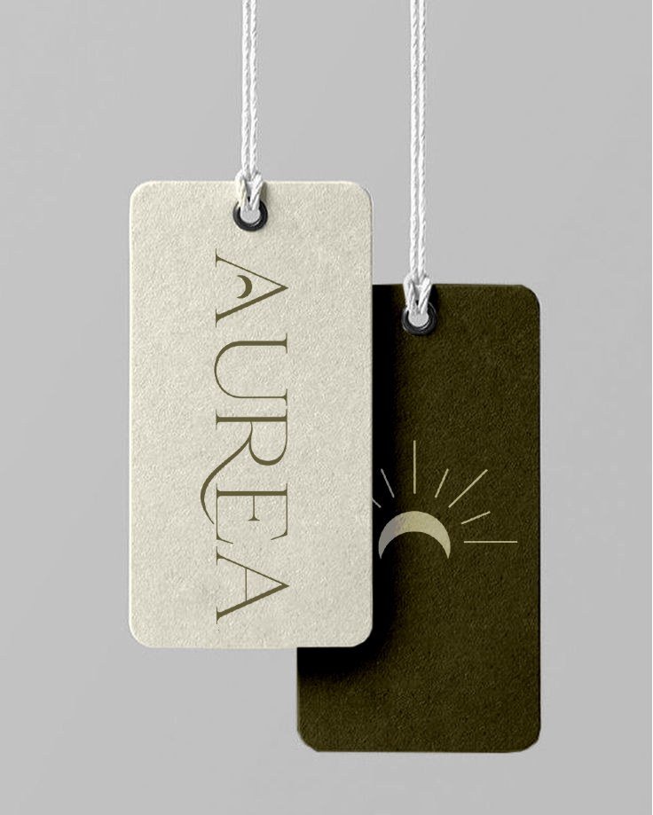
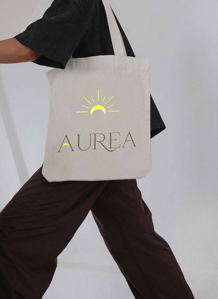
The mark pairs a rising sun with radiating rays above the AUREA wordmark — set in an elegant serif with a distinctive swooping R. The logo must always be used in its entirety, never altered in shape, color or proportions.
Typography
Two faces, one voice
Montserrat carries headlines and paragraphs; Playfair Display sets the subheadings. Used in their original, approved versions, balanced to reflect the look and feel of the brand.

HEADLINES & PARAGRAPHS
Montserrat
SUBHEADINGS
Playfair Display
Aa Bb Cc Dd Ee Ff Gg — 0123456789
Palette
Elegant & modern, always as approved
The primary colors are black and white, carried by shades of dark red and dark beige as accents — always used in their original, approved versions, in balance with the brand's overall feel.
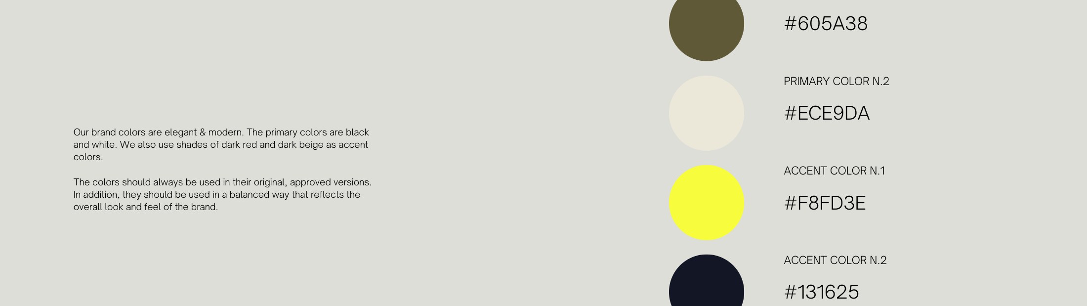
Ink, cream, and two golds — click any chip to copy its hex.
Imagery
The launch campaign
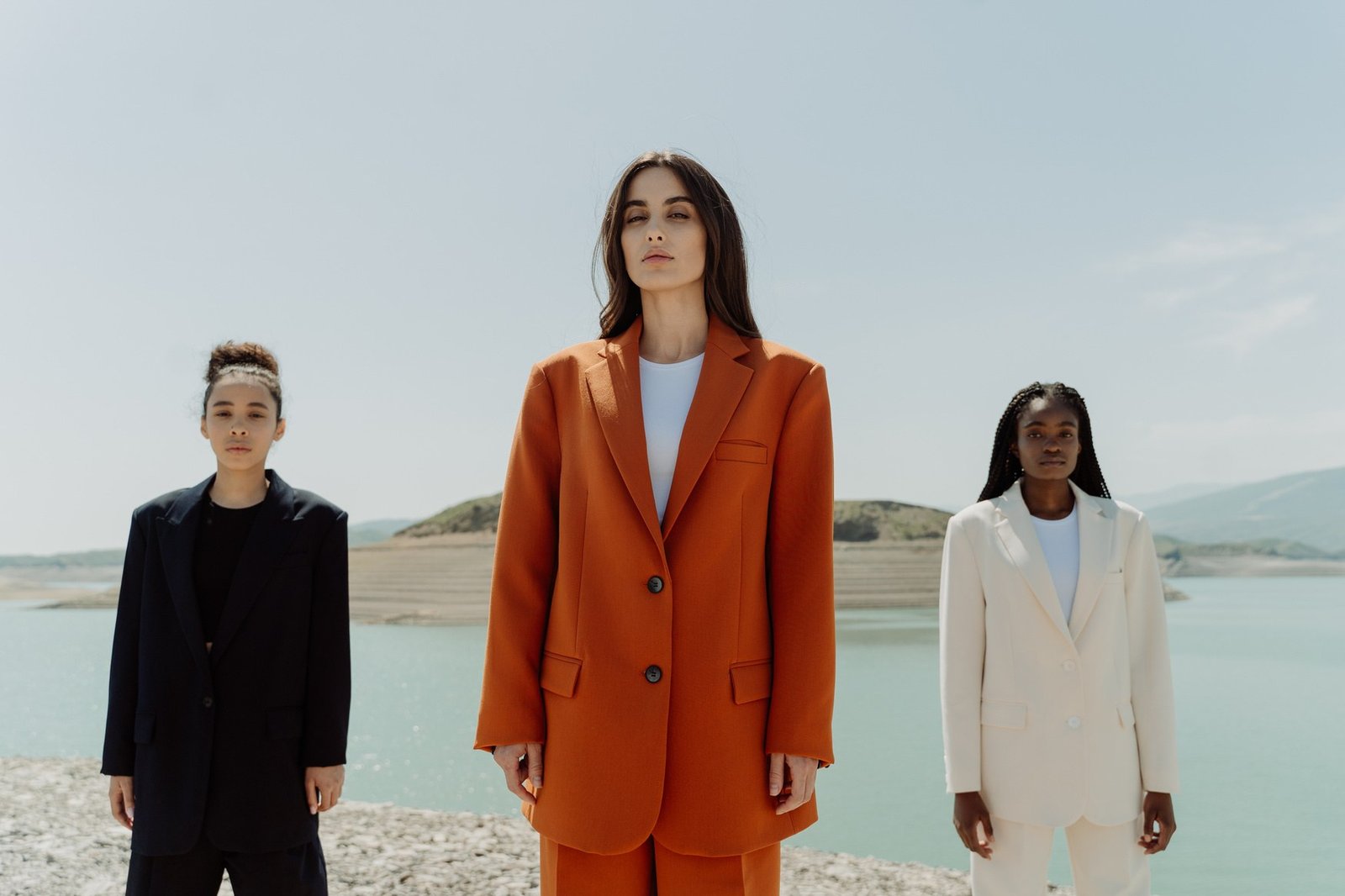
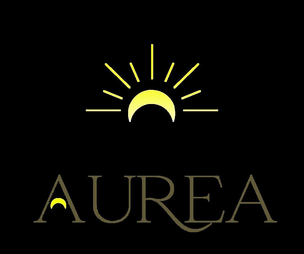
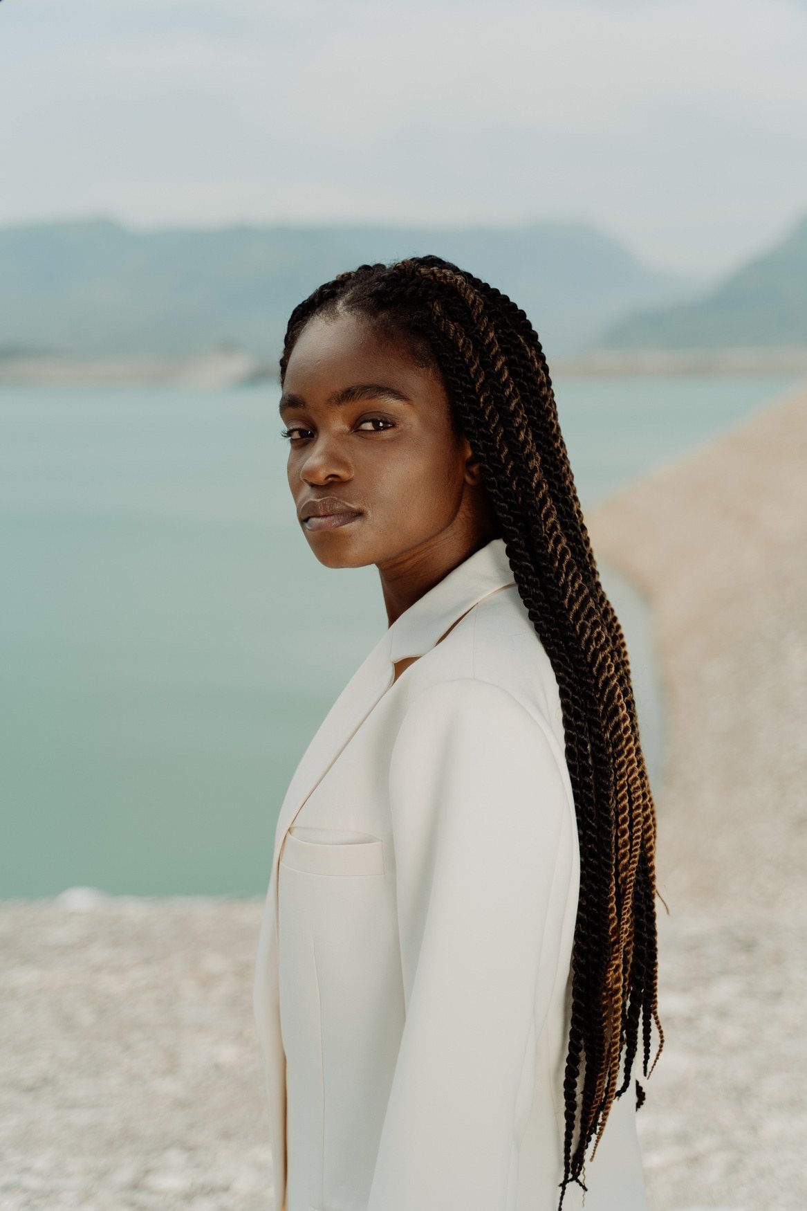
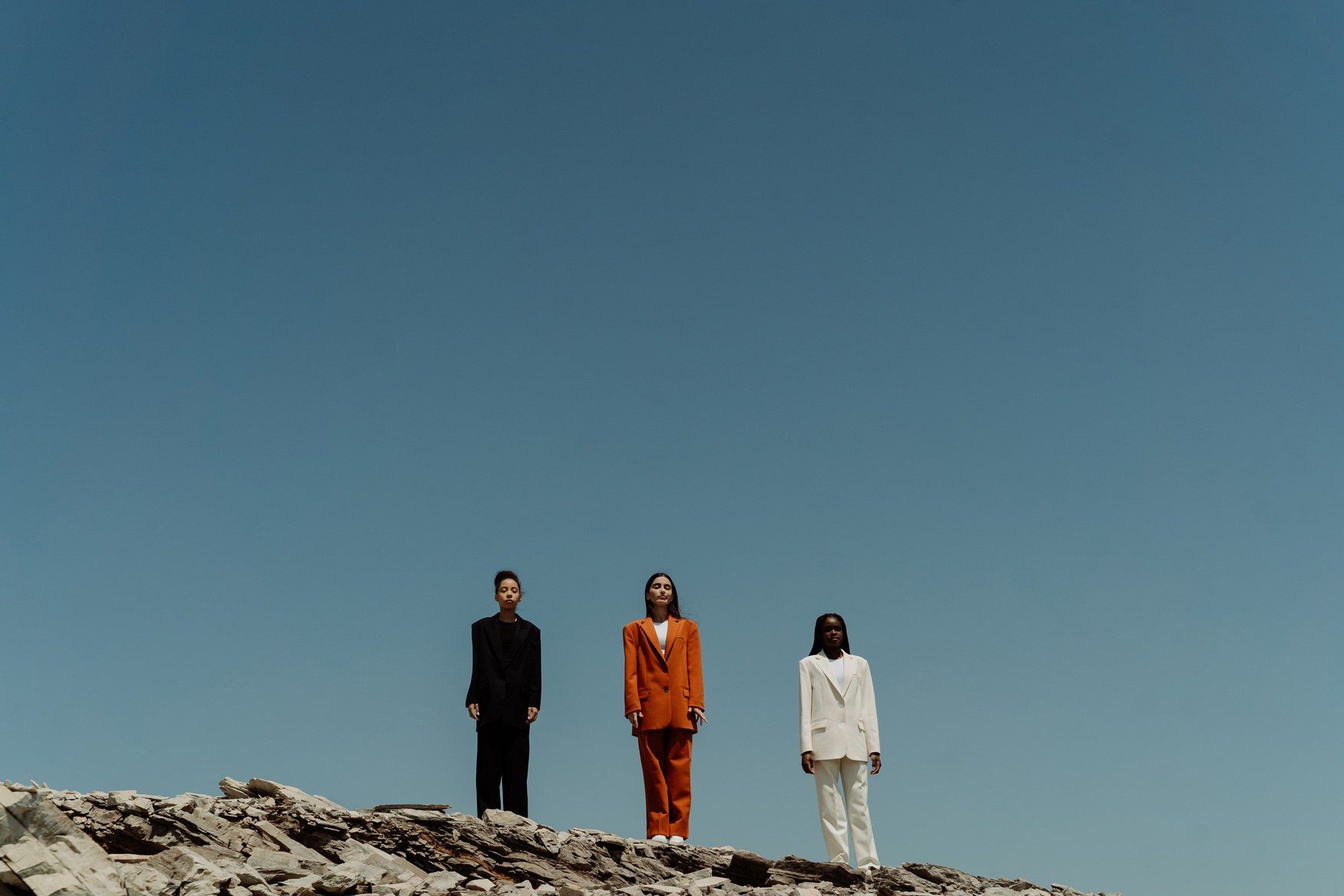
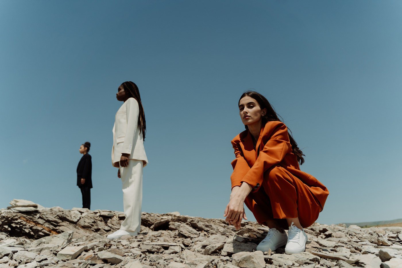
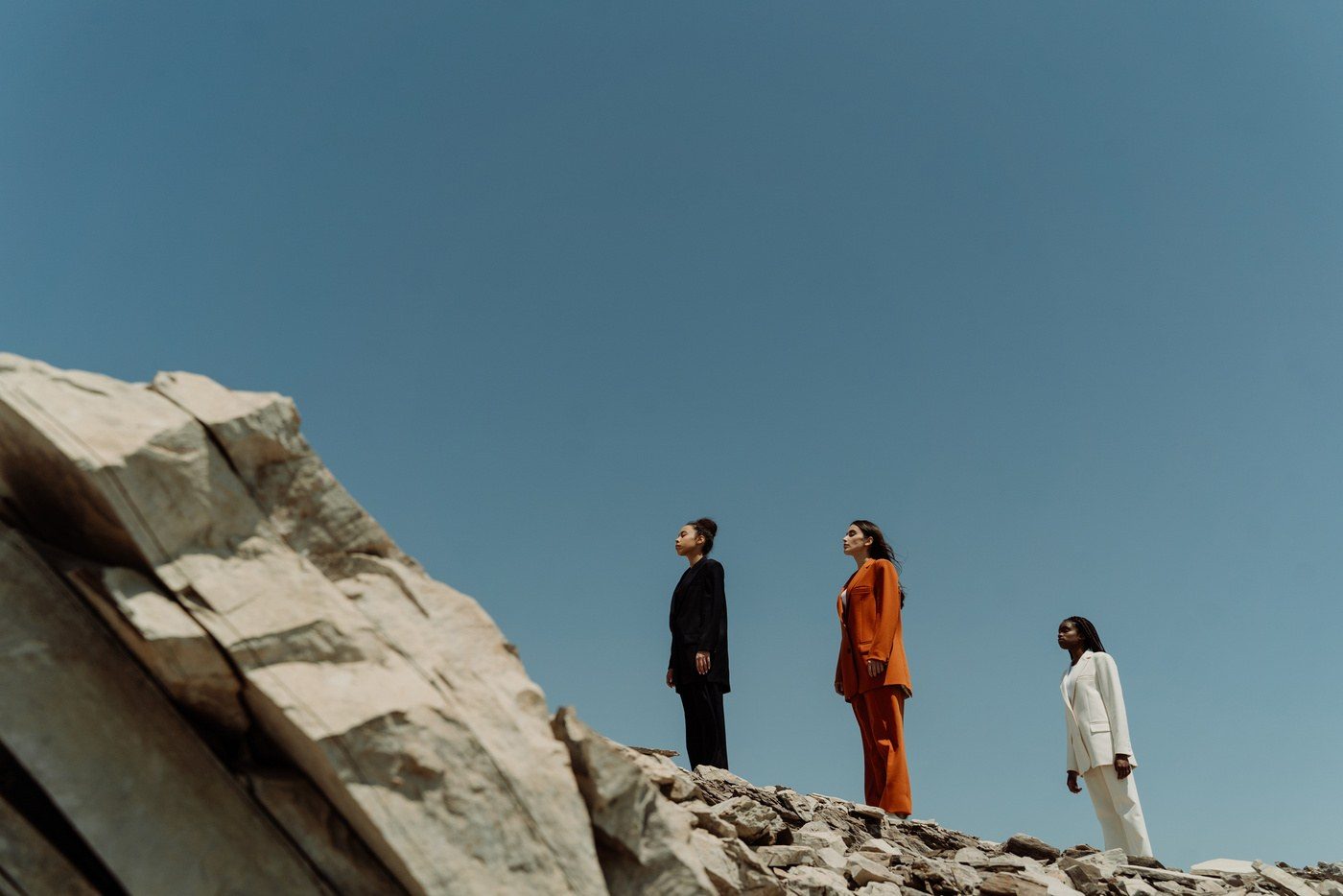
Shot on the shore: rust, cream and ink against water and stone. The imagery rules are simple — natural light, honest textures, and silhouettes that read as luxury without shouting.
Applications
The brand, out in the world
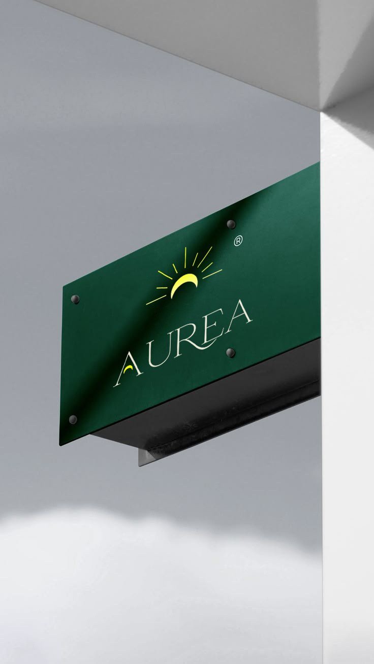
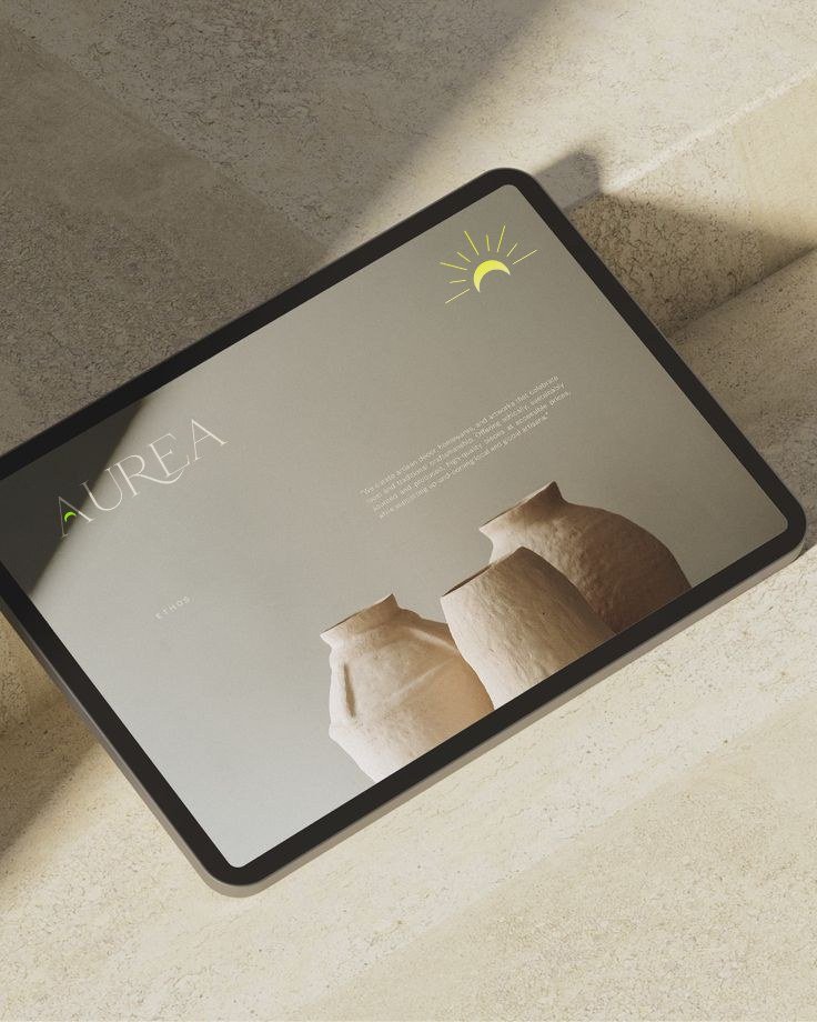
From hang tags to signage to the digital storefront — one sunrise, every touchpoint.
The Challenge
"Old money" is easy to draw and hard to wear — most luxury identities either whisper into invisibility or cosplay wealth. AUREA needed a system that reads luxury at first glance yet stays young, wearable and affordable — without tipping into costume.
The Solution
A complete guidelines book: the sunrise-serif lockup with strict usage rules, Montserrat × Playfair Display pairing, the ink / cream / gold palette, and a full shore-shot imagery direction — one warm, gilded language from hang tag to storefront to screen.
Deliverables
Brand Identity
- —Sunrise serif lockup + usage rules
- —Primary & approved logo versions
- —Ink / cream / gold palette system
- —Montserrat × Playfair type system
Art Direction
- —Launch campaign photography
- —Shore imagery direction
- —Portraits & campaign retouching
- —Imagery rules for future shoots
Applications
- —Hang tags & packaging
- —Storefront signage
- —Tote & merch suite
- —Digital flagship mockups
Credits
Roles
OUTCOME
A gilded language, ready to wear.
From the first ray of the sunrise mark to the last hang tag, AUREA now speaks one gilded language — classic enough for old money, bold enough for the generation that invents its own.
Your brand next
Building a brand worth remembering?
Whether you're a fashion house, a startup or a cause — we build identities from concept to execution, all under one roof.