
Brand Identity · Guidelines · Complete System
BeFirst — less is more, and more is here
A complete identity built to move fast and stand clean: a "T" lockup, the power of B/W, six named colors, KO Media typography, token imagery, and a full guidelines book — every rule written so the brand stays sharp from business card to billboard.
CLIENT
Confidential
SERVICES
Identity • Guidelines • System
DURATION
2026
STATUS
Identity live — delivered
The name the identity was built to carry

"White space as the continent."
SIMPLICITY RULES • CONSISTENT EXPERIENCE • THE POWER OF B/W
The story
Built to be first
BeFirst arrived with ambition and a clear ask: an identity that could go to market fast and age well. The brief was discipline, not decoration — "build the system first, make it impossible to dilute."
So we designed an identity that doesn't lean on ornament. A geometric "T" lockup that reads as a symbol, not a letter. A black-and-white system where contrast does the talking. Six colors with their own names — Light Grey, Stone, Blackout, Tailwind, Horizon, Oceanic — each with a job to do.
The guidelines book closes the loop: clearspace, token rules, illustration direction, typography — every decision written down so the brand stays BeFirst no matter who touches it.
What the book says
Four rules, straight from the guidelines
01
Simplicity rules
Less is more — the logo must be instantly recognizable at all sizes and in all contexts.
02
Consistent experience
One system across every touchpoint — the brand behaves the same everywhere it lands.
03
The power of B/W
Black and white first — color is the accent, contrast is the voice.
04
White space as the continent
Emptiness isn't leftover — it's the land the brand lives on.
Brand guidelines
The identity system, up close
No PDFs, no downloads — the whole system lives right here on the page: the lockup, both grounds, the T clearspace rule, the six named colors, typography and imagery.


The symbol
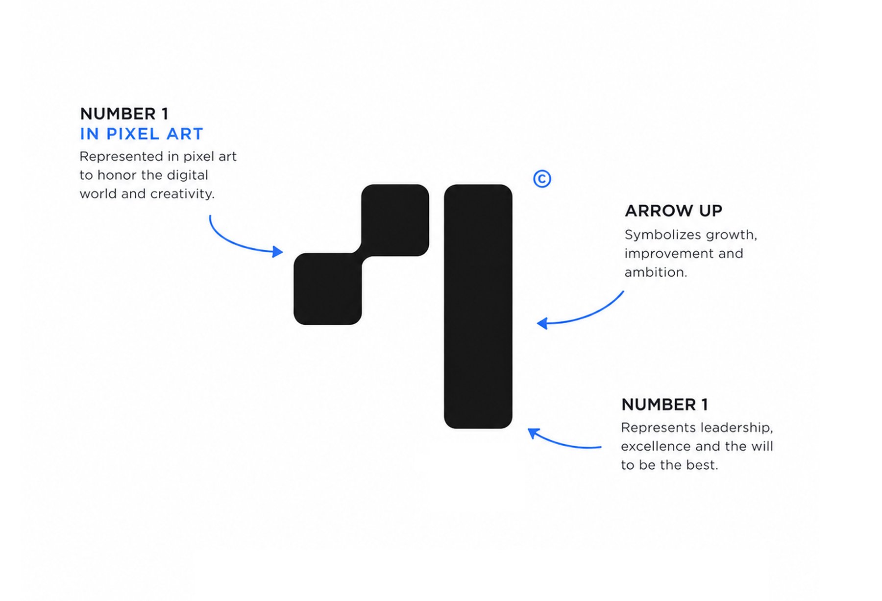
A "T" that guards its space
Clear space around the logo equals the cap height of the "T" — nothing breaks the limit that the T's create. The mark reads as a symbol first and a letter second, which is exactly what a brand awaiting its name needs.




B/W first, blue for the moments that matter. Click any chip to copy its hex.
Typography
KO Media — swiss bank sensibilities
Print and digital intertwined: strong, safe, unique. A general-use face that carries the brand's quiet confidence — no display theatrics, just authority.
Aa
KO MEDIA — BOLD (GENERAL USE)
Imagery
The look and feel
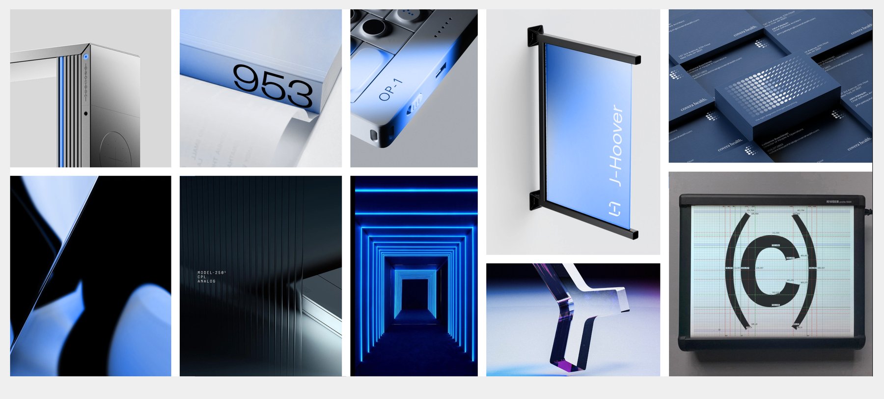
A visual guideline for photography: how the core branding colors and real-world images meet. Consistency over decoration.



Token imagery
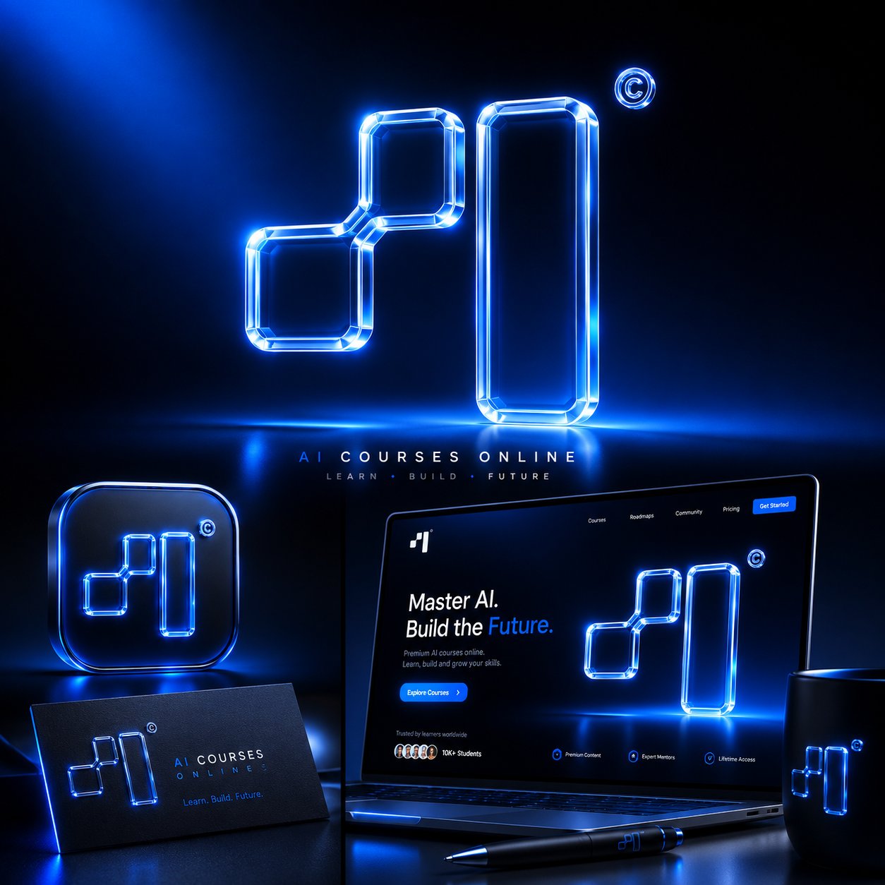
One token, two dimensions
The rules: the token's 2D graphics live in the core blue or black — the 3D graphics always wear the blue gradient. Illustrations either carry the gradient or go black-and-white to keep the brand tight.

Applications
Everything working together
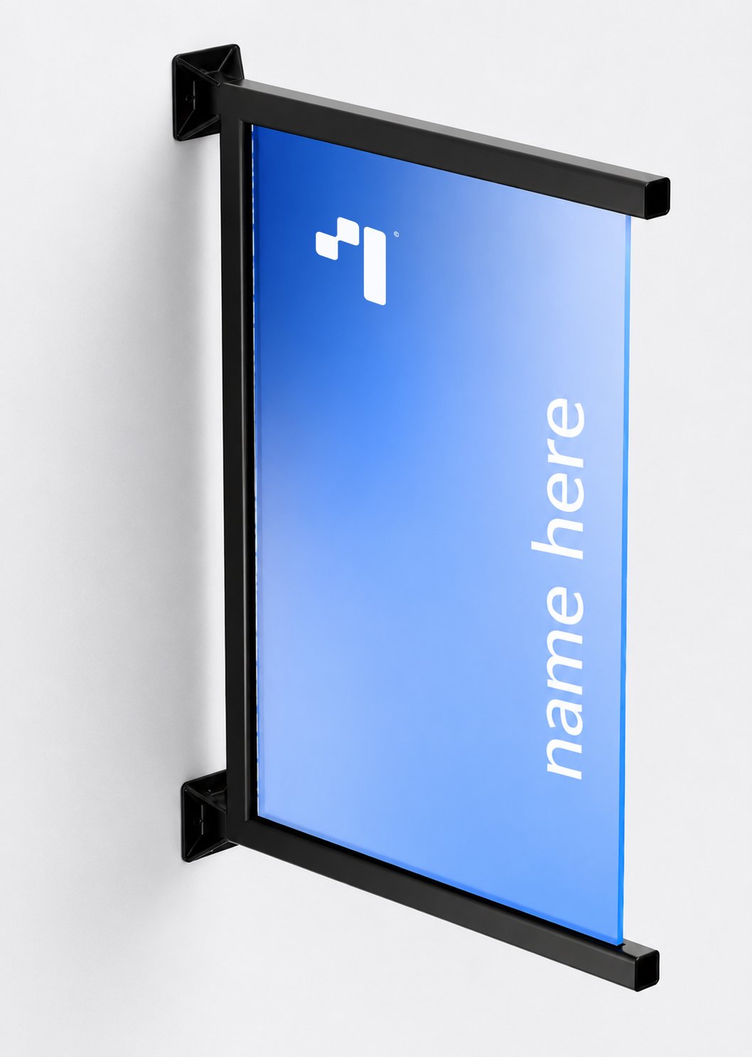
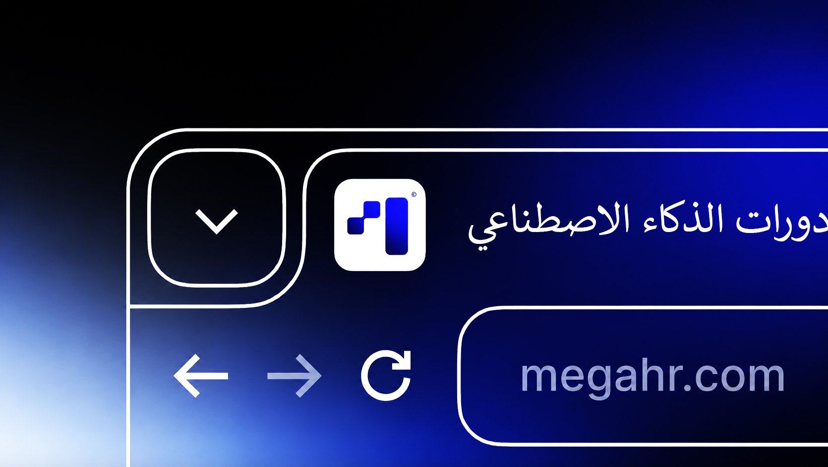
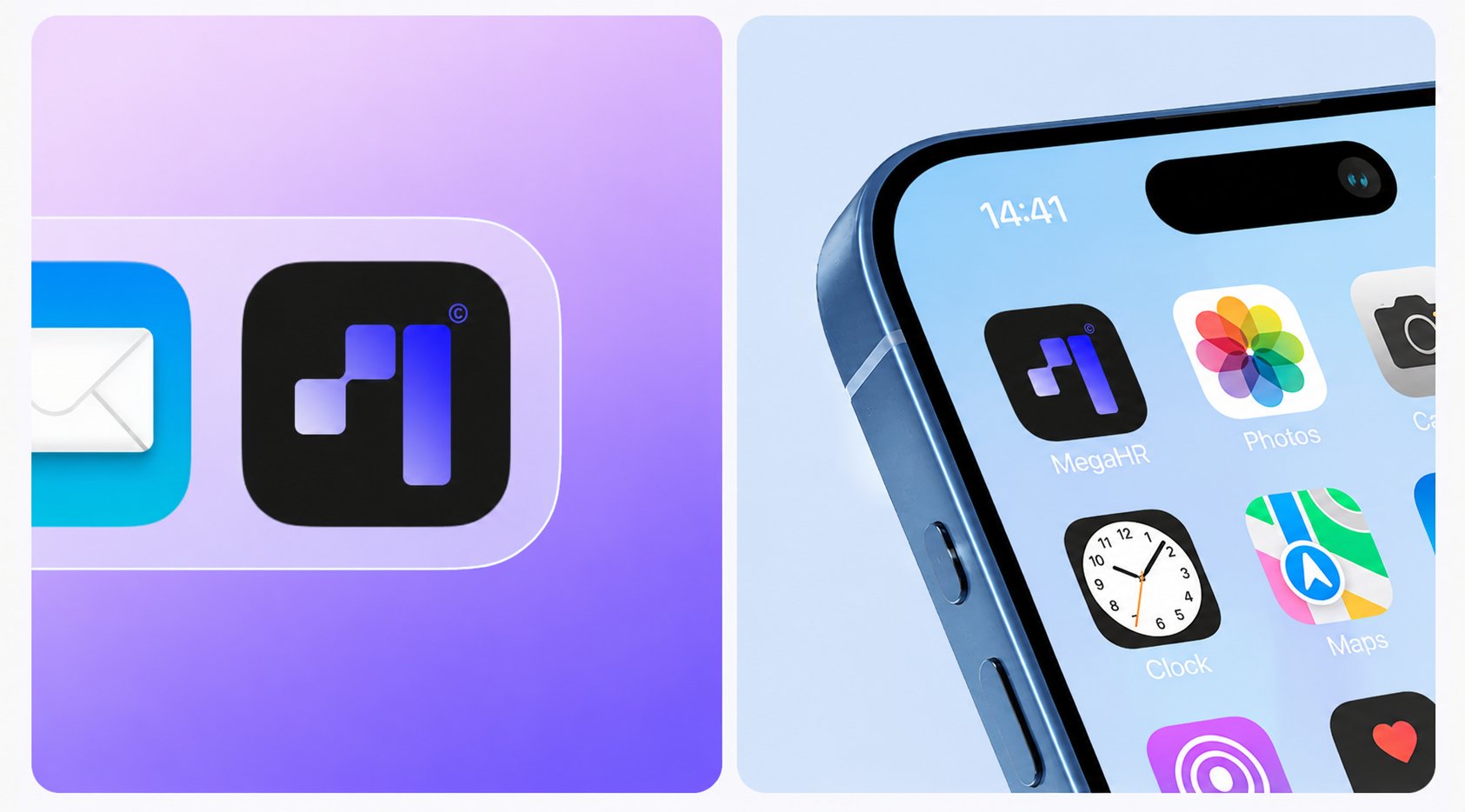
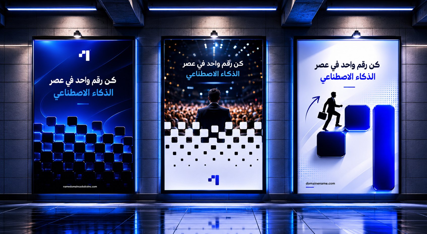
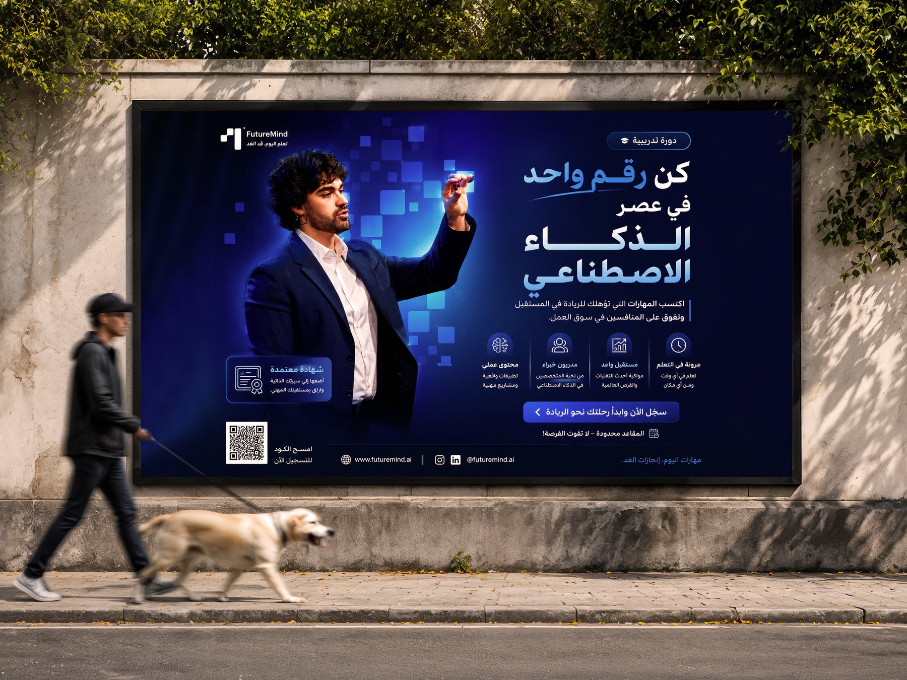
Examples of the logo, typography, gradients and token imagery in use together — the system proving it holds, from business card to signage.
The Challenge
Design a complete brand — logo, colors, type, imagery, applications, a full guidelines book — for a company that doesn't have a name yet. No wordmark to anchor on, no verbal identity to lean on. Every asset had to be ready for market from day one.
The Solution
Go symbol-first. A geometric "T" lockup that guards its own clearspace, a B/W-first system where contrast replaces vocabulary, six self-named colors, KO Media for quiet authority, and strict token & illustration rules. The nameplate on the cover says it plainly: BeFirst — a name that makes the promise the system was designed to keep.
Deliverables
Brand Identity
- —"T" symbol & single-line lockup
- —Black & white ground system
- —T-clearspace construction rules
- —Name-agnostic asset architecture
Color & Type
- —Six named core colors
- —Secondary gradient set
- —KO Media Bold typography system
- —Usage hierarchy: B/W first, blue for moments
Imagery & Book
- —Photography moodboard direction
- —Token 2D/3D imagery rules
- —Illustration & application examples
- —Complete guidelines book — 15 pages
Approach
Strategy
Restraint as a brand strategy. By refusing to depend on a name, the identity becomes stronger than one: the symbol carries recognition, the palette carries emotion, the typography carries trust — and the name, when it arrives, steps into a system already standing.
Credits
Roles
OUTCOME
A brand that was ready before its name was.
A complete identity system — symbol, grounds, clearspace, six named colors, gradients, typography, imagery rules and applications, bound in a 15-page guidelines book. Every rule written down; the name stamped on the cover: BeFirst.
Your brand next
Got a brand waiting for its world?
Whether you have a name or not — we build identities from concept to execution, all under one roof.
Next Case Study