
Café Branding · Merch Line · Identity
Formula One Coffee Shop
A coffee shop built like a race team. The F1-style mark, the SHAKE FAST / DRINK LAST slogan system, checkered flags on everything from coasters to aprons — and one promise: your coffee, served at pit-stop speed.
CLIENT
Formula One Coffee Shop
SERVICES
Identity • Merch Line
DURATION
2026
INDUSTRY
Café / Lifestyle
Shake fast.
Drink last.
The concept
Coffee at race pace
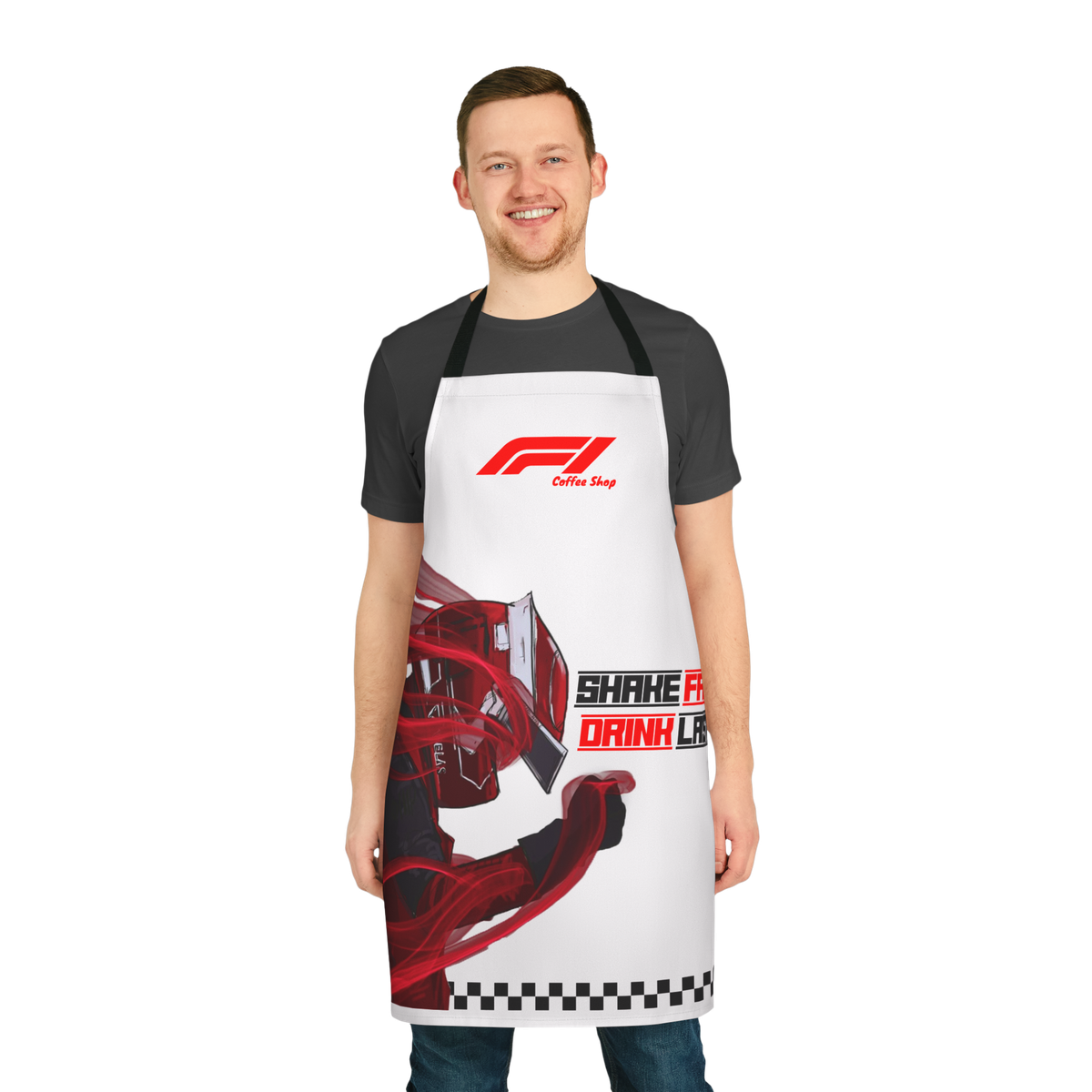
Formula One Coffee Shop borrows the theater of the grid: the winged F1-style mark, the checkered flag, the speed-italic lettering, racing stripes on every surface. But the product is coffee — shaken over ice, built for people who treat their morning like a flying lap.
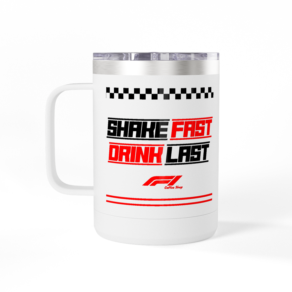
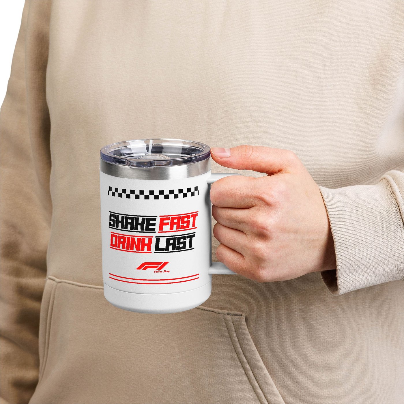
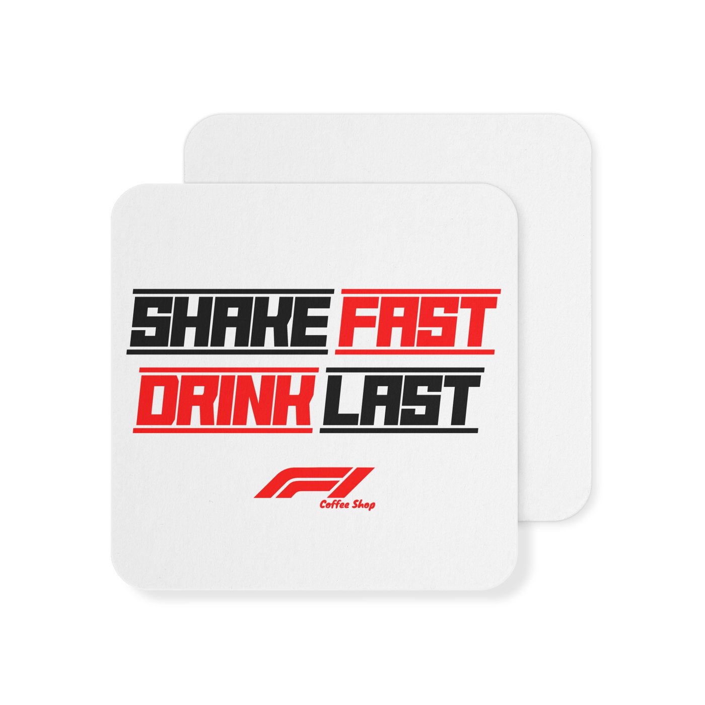
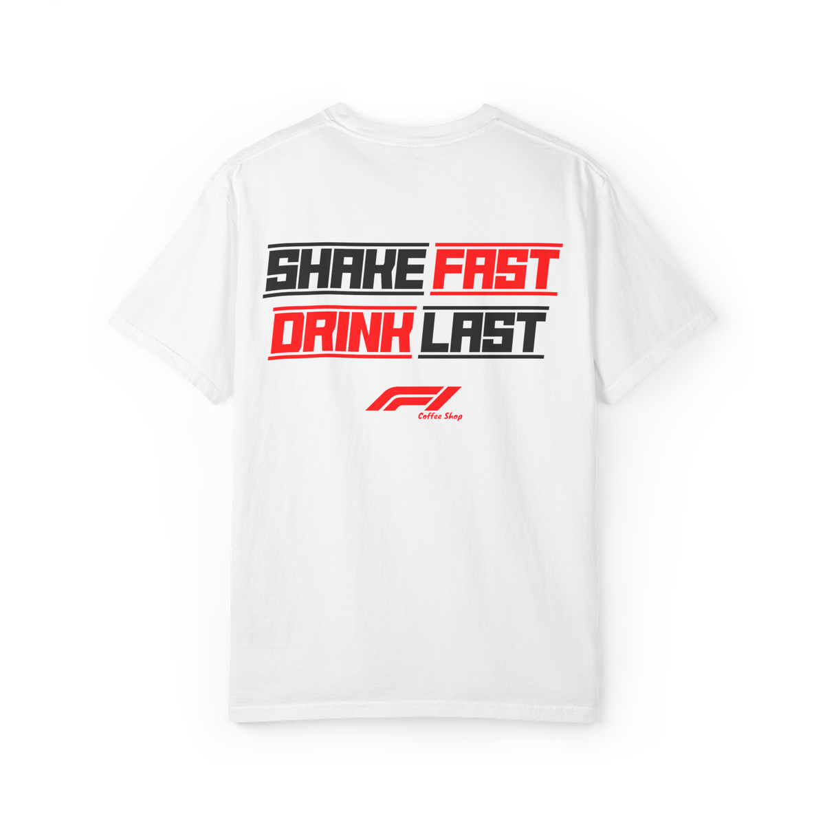
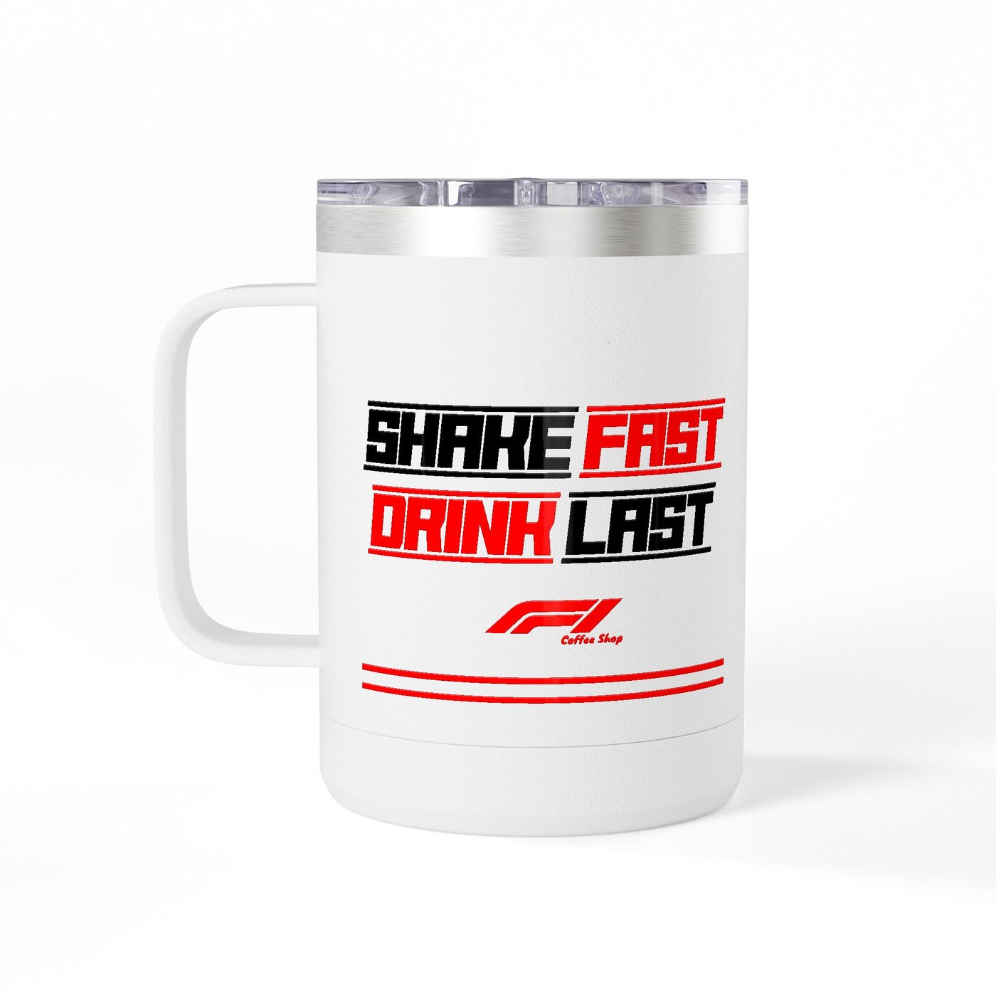
The slogan carries the whole identity: SHAKE FAST — DRINK LAST. Two commands, set in alternating black and racing red, stacked like starting-grid boxes. It reads the same on a coaster, a tee back, or the shop's wall.
The mark
A wing, a wink, a wordmark
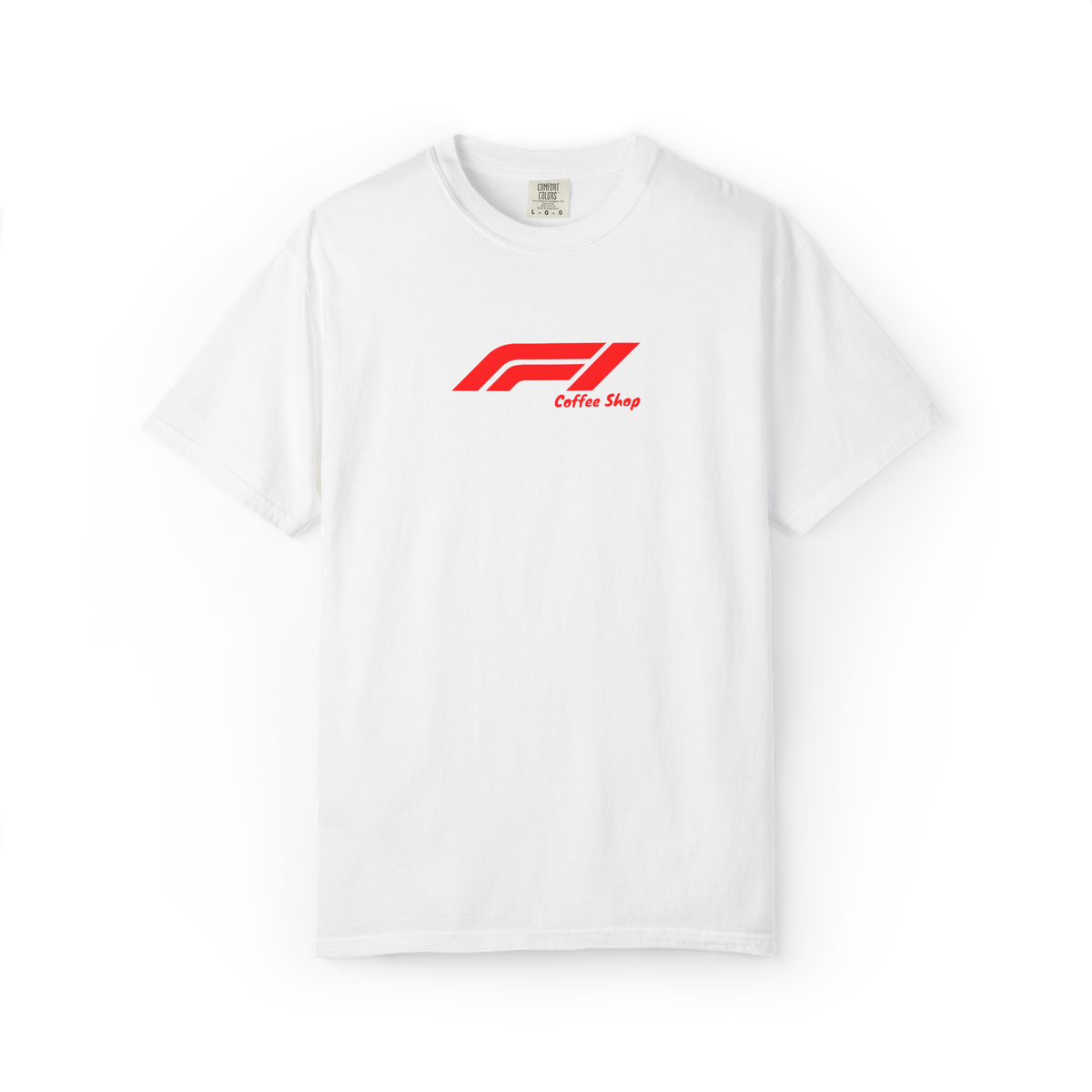
The logo re-imagines the racing wing as a coffee run: the angled F forms sliced like slipstream lines, with "Coffee Shop" set in a playful script beneath — the one moment of softness in an otherwise full-throttle system. Racing red on white, or white on black.
The slogan system
Two commands, four tiles
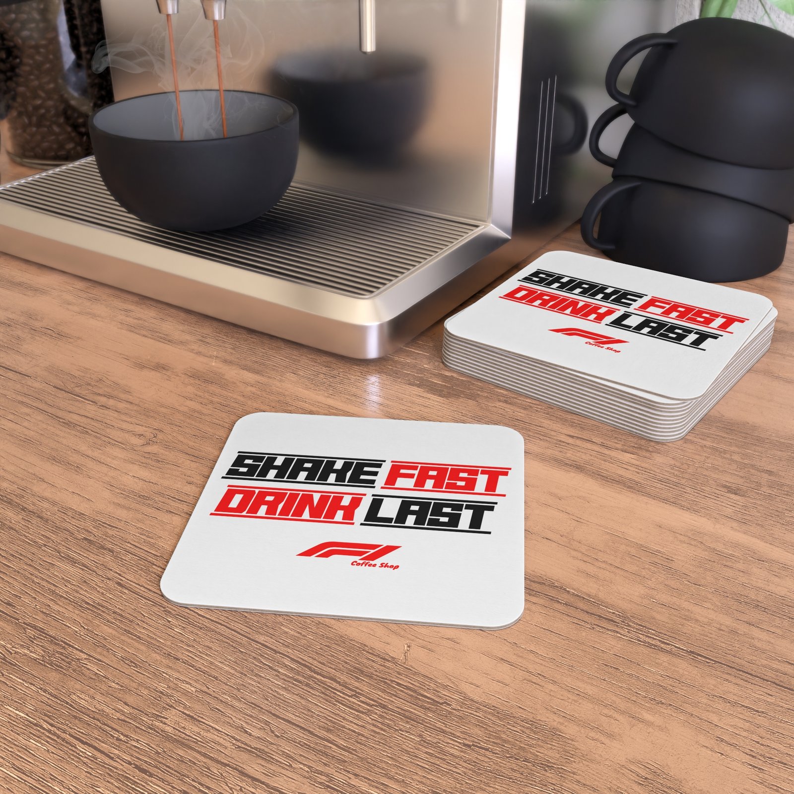
SHAKE FAST / DRINK LAST is built as a grid: four words, alternating ink and racing red, each boxed in like a grid slot. The system scales from a 3″ coaster to the back of a tee without ever changing its structure.
The merch lineup
The full grid
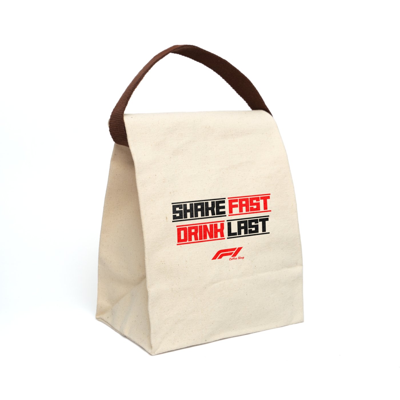
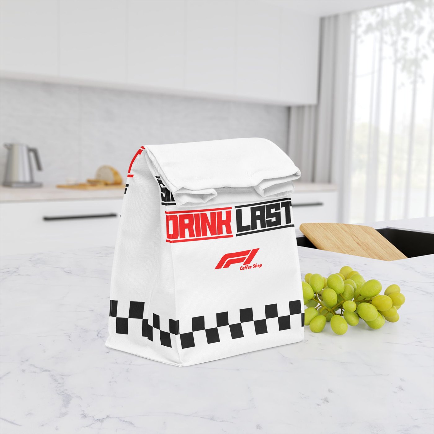
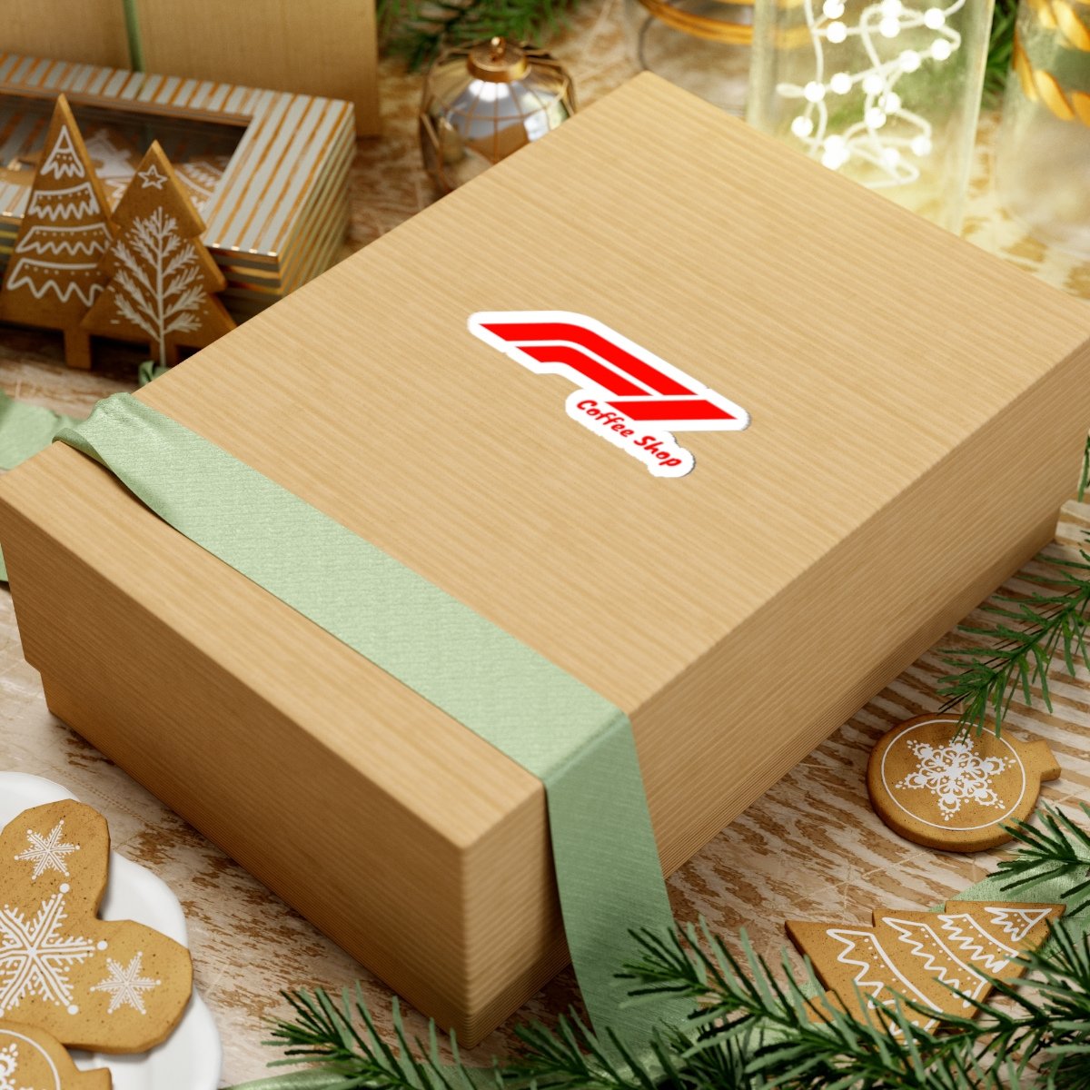
Every piece of the pit kit — drinkware, wear, and take-away — running the same livery.
The poster
One moment of elegance
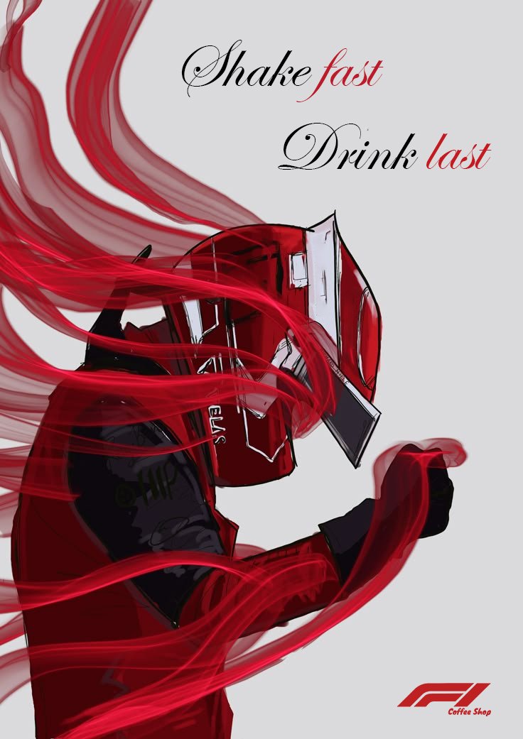
Where the merch shouts, the poster whispers: the driver in flowing red ribbons, the slogan set in script — Shake fast, Drink last. The same words, the opposite gear. A brand that can do both owns the room.
Palette
Pit-lane primaries
Racing red, full black, clean white — sampled straight from the livery, plus the kraft-paper neutral for take-away. Three colors, zero apologies.
Click any chip to copy its hex.
The Challenge
Racing themes drown in cliché — checkered flags and speed lines usually read as theme-party, not brand. A coffee shop needed the energy of the grid without becoming a gimmick, and a merch line coherent enough to feel like one team's livery, not a print-on-demand catalogue.
The Solution
One strict system: the winged mark, the four-tile slogan grid, and a red / black / white livery applied identically across mug, coasters, tees, apron, bags and gift kits — with a single scripted poster as the elegant counterweight. Discipline makes the speed believable.
Deliverables
Identity
- —Winged F1-style coffee mark
- —SHAKE FAST / DRINK LAST slogan system
- —Checkered-flag graphic language
- —Red / black / white livery palette
Merch Line
- —Insulated travel mug
- —50-piece coaster run
- —Tees — mark front, slogan back
- —Barista apron with driver art
Packaging & Print
- —Kraft take-away bags, two versions
- —Gift-kit box with logo sticker
- —Launch poster — the driver piece
- —Café counter styling
Credits
Roles
OUTCOME
Lights out — and the brand is away.
One livery, every touchpoint: from the coaster under your cup to the apron behind the bar, Formula One Coffee Shop now runs a grid's worth of merch that all reads as one team. Shake fast. Drink last.
Your brand next
Building a brand that moves?
Whether you're a café, a startup or a cause — we build identities from concept to execution, all under one roof.
Next Case Study